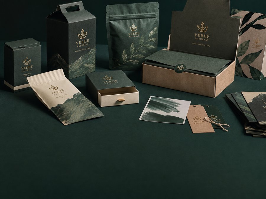
Packaging has one job that a beautiful screen mockup cannot prove: it has to win attention in the real world. On a shelf, your product competes with colour, price, promotions, neighbouring brands and hundreds of visual signals at the same time.
That means packaging design needs to be judged at the distance and speed of a real shopper, not only as a polished presentation on a laptop.
Design for the first glance
The first few seconds matter. Strong hierarchy makes the most important information obvious: what the product is, why it matters and why someone should pick it up.
Typography, contrast, scale and negative space all contribute to that first-glance decision. A package can be beautiful and still be difficult to read. Shelf design has to be both expressive and immediately understandable.
Make the brand recognisable
Packaging should feel like the same brand customers encounter online, in stores and in advertising. Repeated colours, type choices, graphic cues and image direction build recognition across a range.
Consistency is especially important when a product family grows. A good packaging system allows new variants to feel distinct while still belonging together.
Design for production
Print is physical. Materials, finishes, folds, ink coverage, paper texture and manufacturing constraints can change the final result. Designing with production in mind prevents surprises between the screen and the shelf.
The best packaging balances three things: a strong brand idea, fast shelf communication and practical production. When those three work together, the design does more than look premium — it helps the product get noticed.